Symmetry in Design

symmetry

Weekly Photo Challenge Symmetry

To some extent, I try to avoid exact symmetry in my stained glass panel designs. The biggest reason is that I’m not very good at being exact about anything.  So chances are that – even if I try – the left side will not mirror the right.

Weekly Photo Challenge Symmetry


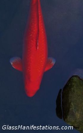
So instead, I have fun coming up with designs that I like to call “Symmetrical… But Not Really.” Like the koi in these photos. A fish eye on the left, a fish eye on the right. A fin on the left, a fin on the right. The orange koi even goes so far as to sport matching wing tips – er, fin tips.

koi chap

The other chap, while having the symmetry of matching anatomical bits and pieces, shook things up a bit when it came to body art. A splotch of orange here, two splotches there… maybe not as soothing and peaceful to look at as his pond mate, but interesting and worthy of contemplation in his own right. *

An example of my SBNR technique can be seen in the geometric design of the panel below. The nine white-looking pieces (they are actually clear glass; photography’s not my strong suit) are from a pre-cut bevel cluster, meant to be assembled into a symmetrical pattern. But they are incorporated into a larger design that – while still pulling everything together in a balanced scheme – is not a match of left and right. To me, it gives the panel more vibrancy and greater interest.

And, of course, it helps avoid that whole exactness deficiency of mine.

I figure if it’s good enough for Mother Nature and her koi chaps, then it’s good enough for me.z8


* The assumption of male gender of the koi is based strictly on my desire to use the term “chap.” I do not have the wherewithal to determine fish gender based on an aerial view. Nor am I particularly interested in acquiring that skill set. Sorry, I have to draw the line somewhere.

 Weekly Photo Challenge:  Symmetry

According to Scale

Weekly Photo Challenge: Scale

Weekly Photo Challenge: Scale

Stained glass is not a medium that lends itself easily to realism. I mean, I can make a panel that depicts something specific – a rose, for example – but even if I attempt to make it look realistic, you aren’t likely to view it and be led to believe that you are seeing an actual rose.

Even from a distance. In the dark. With one eye closed.

I really like that, because it lets me off the hook. I don’t feel compelled to portray images in perfect proportion or according to scale. Which is good, because I don’t think I could do it if I tried.

A lot of artistic people are blessed with multiple creative talents. They can paint and draw and sculpt, or whatever. Their artistic abilities just splash all over the place, like an overfilled cup of coffee. Me, not so much.

I can design a stained glass panel to my liking, but if you ask me to make a drawing of the same subject, the outcome would be pretty dismal. That’s why God invented abstract art… for people like me. And Picasso.

Window installation at UCC church, Tillamook, Oregon

Window installation at UCC church, Tillamook, Oregon

The only time I attempted realism in a panel was with a commissioned piece for a church. The window had to “match” or compliment the already existing windows in the structure, which were of a realistic nature.

And so I took on Jesus. Of course, we don’t really know what Jesus looked like, so I pretty much took my cue from the drawings I’d seen throughout my stint in Sunday school. And in those pictures, Jesus is a pretty proportionate fellow.

I will never be satisfied with the results (which you can see pictured here). Does it look like his left forearm is raised higher than the right (hint: it’s supposed to), or does it look like his left arm is shorter than the right (hint: that would be bad)? There are other areas that do not seem made to scale (depending on how you interpret body placement), but I’ll give myself (and Jesus) a break and not pick him totally apart.

So here’s my life analogy: things don’t always have to be according to scale. People talk about wanting to live “balanced” lives, and that’s great. But sometimes it’s okay to let one arm hang a little lower than the other.

Yeah, well, analogies aren’t my strong suit, either.


The Daily Post weekly photo challenge: Scale

Depth Finder


Close up of light reflection on stained glass panel.

Close up of light reflection on stained glass panel.

In my little corner of the world, it seems that interest in glass work is swinging greatly towards the direction of “warm glass,” or kiln-formed glass. Which is very understandable. There is so much potential for creativity in the three-dimensional forms that melting glass allows.

Even the vocabulary of fused glass is fun: slumping, frit, draping, stringers, confetti…

And the vocabulary of my work with flat stained glass panels? How about “fid?” It’s just not a sexy word, although it works well in Scrabble when you’re really stuck. Or “lead,” which elicits sayings like: get the lead out… lead-footed… lead poisoning. Also not sexy.

Of course, there is some dimensionality in panels – in glass bevels, for example. Or in textured glass. And a flat panel doesn’t exclude the incorporation of three-dimensional objects.

Just because a panel is flat, however, does not mean it lacks depth.

“Depth” has so many meanings beyond the concept of a dimension. From Dictionary.com:

  1. a dimension taken through an object or body of material… [the extent, measurement, or distance downwards, backwards, or inwards]
  2. the quality of being deep; deepness.
  3. complexity or obscurity, as of a subject: a question of great depth.
  4. gravity; seriousness.
  5. emotional profundity: the depth of someone’s feelings.
  6. intensity, as of silence, color, etc.
  7. lowness of tonal pitch: the depth of a voice.

So a flat stained glass panel can be complex – either in design or in abstract meaning, can emote or evoke a sense of seriousness or profound feeling, and can incorporate intense colors. And if it could talk, who knows? It might just sound like Morgan Freeman.

Not bad for only two dimensions.


Weekly Photo Challenge:  Depth

Express Yourself (Weekly Photo Challenge)

hammer

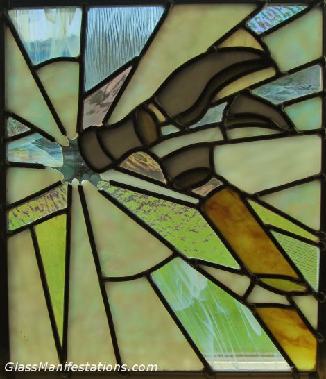
“Hammer Shattering Glass Shattering Hammer” What does it mean?

I’ve been pondering the question of “What is Art?” and consequently, what makes an artist?

and what is the purpose of art?

and who decides all of these things?

and what is the meaning of life?

Oh, wait. Nix that last one. I quit pondering that a long time ago.

I’ll be exploring these questions in future posts. Probably…

But today, the Daily Post weekly photo challenge is based on the theme “Express Yourself,” which has led me to musing about art as a means of expressing oneself.

Maybe that’s a basic parameter of art: the artist is creating/performing/producing art as a means of self-expression.

But if an artist creates something in order to express him- or herself, does it matter whether the viewer understands what it is that the artist is trying to express? Or is it the act of expressing oneself all that really matters?

I share photos of my newly completed stained glass panels on FaceBook, a practice which is primarily undertaken because I like to get positive feedback on my work. And since they’re all my “friends” on FB, I can be fairly confident that I won’t get flamed. I’m kind of a coward that way.

I got a FB comment once that did rankle me for a while, though. In response to a photo of one of my pieces, someone wrote, “Cool. But what is it?” It didn’t bother me that this woman couldn’t recognize what I was trying to portray. My intent was more to convey an emotion – or a mood – than to depict a literal object.

What bugged me was that she felt the need to ask. My response to her was along the lines of, “It’s whatever you want it to be.” I know what it means to me, and it’s irrelevant to me as to what it meant to her. Not that I don’t care; it’s always interesting to know what others see in your work. And someone else’s interpretation might give me new insight as well. But whatever her interpretation is, it’s neither good nor bad, neither right nor wrong.

So another thought… does it matter whether the artist him- or herself knows what they are trying to convey? Does art have to have any meaning at all?

Jackson Pollock’s paintings are about as abstract as art can get. A Wikipedia article about him states that, “[In] continuing to evade the viewer’s search for figurative elements in his paintings, Pollock abandoned titles and started numbering his works.”

Pollock’s wife, Lee Krasner, is quoted as explaining the numbering of his works thusly: “Numbers are neutral. They make people look at a picture for what it is—pure painting.”

Pure painting… Does that mean that it is not meant to be interpreted at all? Did Pollock have his own interpretations for the pieces, or was he simply practicing “pure painting?”

And if there is meant to be no interpretation on the part of the artist or the viewer, is it in fact art?

So many questions…

My title for the panel pictured above is “Hammer Shattering Glass Shattering Hammer.” (Or No. 11, if you prefer.) I’d be curious to know how others interpret the piece.

Any comments?
Express Yourself
Serenity: Weekly Photo Challenge

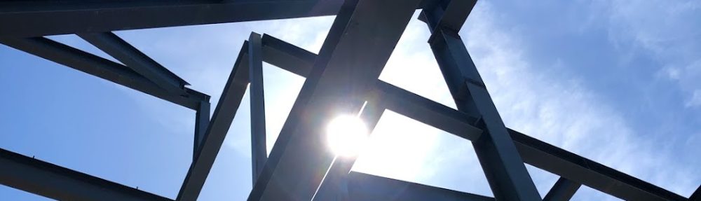
This week’s Daily Post photo challenge is about sharing one’s interpretation of serenity.

It got me thinking about how I would depict serenity in stained glass. Not a serene setting or scene per se, but the actual quality of serenity. Or how would one interpret happiness, joy, sadness or anger in an abstract manner using glass as a medium?

Anger, for example, could be done up in shades of dark or flaring reds and slashing lines and sharp angles. But then it could also be the cold, icy blue calmness of the type of anger that says, “I don’t get mad; I just get even.”

Makes me want to play around with such concepts and see what kind of designs and color schemes might arise.

But on to the photo challenge:

Serenity can be about finding a calm, peaceful setting in nature where one can slow down and restore their sense of balance.

IMG_0277

Or serenity could mean spending quiet time in the company of loved ones.

IMG_0035

But to me, serenity comes mostly from allowing myself to

be who I really am

wherever I am

in the moment…

IMG_0615

… and to have that be perfectly okay.

Serenity

Shadowed: Weekly Photo Challenge

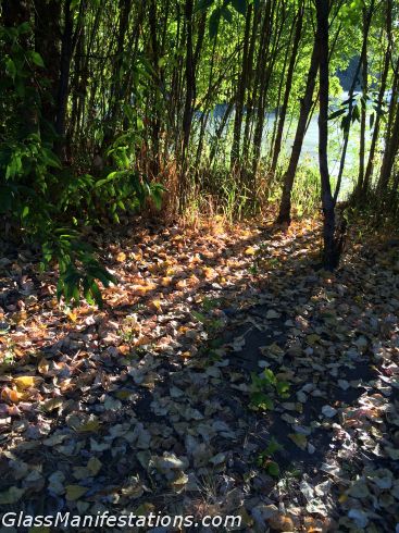
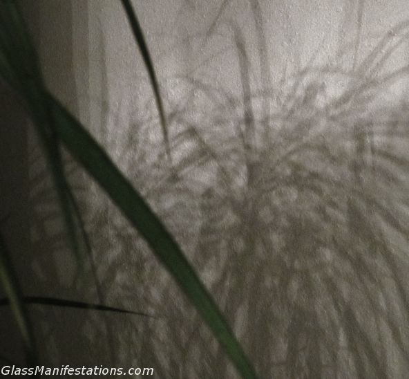
The theme of today’s photo challenge, as offered weekly at The Daily Post, is “Shadowed.” The premise is that, “Experimenting with shadows can be a fun and rewarding way to push yourself to try something new with your camera and your surroundings, and look beyond the obvious shot.”

So today I’m posting some “shadow” photos that I’ve taken recently.

But what I think would be really fun and rewarding would be to experiment with using shadow as a main element in a stained glass panel. Note to self: add that to the queue of design ideas to play with.


Chulesshadow

“The beginnings and ends of shadow lie between the light and darkness and may be infinitely diminished and infinitely increased. Shadow is the means by which bodies display their form. The forms of bodies could not be understood in detail but for shadow.”

Leonardo da Vinci


IMG_0439

“Without black, no color has any depth. But if you mix black with everything, suddenly there’s shadow – no, not just shadow, but fullness. You’ve got to be willing to mix black into your palette if you want to create something that’s real.”

Amy Grant


IMG_0064

“Shadow is a colour as light is, but less brilliant; light and shadow are only the relation of two tones.”

Paul Cezanne

Shadowed